I would be a horrible blogger if I didn’t write about the two-ton elephant in the design room right now — flat design. It is the trend, buzzword, motto, theme, and cliché of 2013. Thousands of words have already been written about the rise and proliferation of flat design, and I’m here to contribute a few more.
I started to write this post after seeing the announcement of a new MailChimp interface being unveiled for release in a few weeks. What caught my attention — besides the design — was that the word “flat” appears nowhere in the announcement. The rumor mill is whispering that Apple is going flat too. I’m going to place a bet that none of the presentations at Apple’s WWDC are going to describe iOS 7 as “flat” either. The bandwagon is taking on passengers and filling up fast.

Now, I know MailChimp and Apple are going to do it right. They’ve put in the research and user testing to refine their iterations and get to a happy place. The problem is all the other people who start hacking away at their website or application trying to chase the look but not completely understanding it. That’s a bold statement; I guess I need an example to back that up. Oh look, here’s one.
Windows 8 vs. Office 365
The instigator for all the flat design hullabaloo was the release of Windows 8 in late 2012. Gradients out, drop shadows out, intricate icons out, cluttered menus and settings out. Focus squarely on the content and drop everything else. Windows 8 got it right. Now other departments at Microsoft are realigning behind the flagship and some are not so successful. Look at Office 365 and its 2013 updates. Sure, it’s flatter, but is it better?
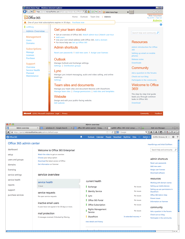
Here is the admin portal before and after. This is a complex screen with lots of options for managing a lot of functionality so it’s a tough starting point anyway. Before is nothing to praise as the pinnacle of web design, but it still had more definition and hierarchy than the new design. Getting rid of backgrounds and using two colors doesn’t do anything to help the structure; it actually hurts. The new design even took a step backwards in terms of responsiveness causing horizontal scrolling at 1280px wide.
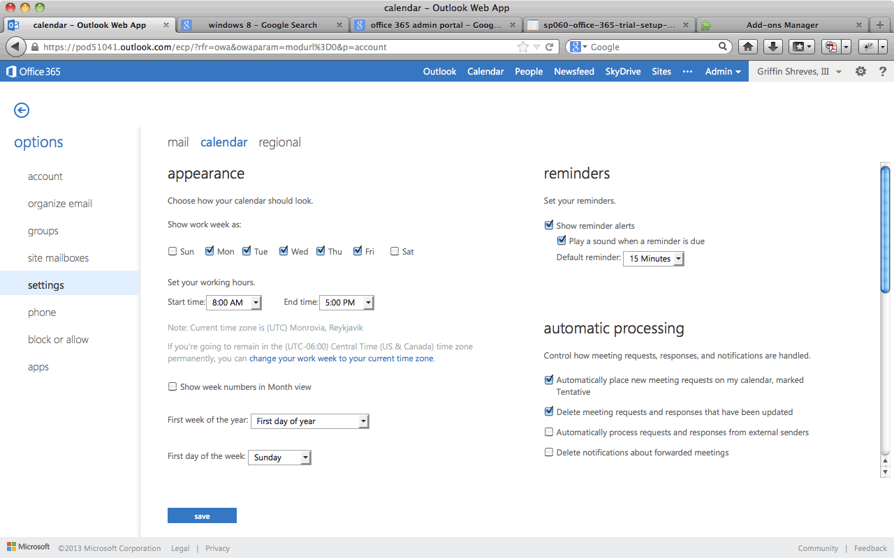
Here’s another example, this time the settings screen for the calendar. There are a few checkboxes and dropdowns for customizing how your calendar looks, how reminders should work, and how to help automate some tasks. Spacing is haphazard. What’s this hierarchy you speak about? All of it blurs into a jumbled mess of lines as you try to find somewhere to look first. Is this flat enough yet?
They Call It Clutter
The idea of simplicity and deleting clutter is an admirable goal; just make sure you know what is clutter and what is necessary. That’s always been a design challenge no matter what trend is popular at the moment. Chasing after flat design can be a slippery slope to messy interfaces. Be careful what you cut and don’t become too flat.