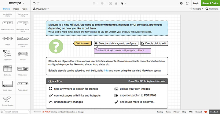
After my post the other day about wireframe.cc, I received a new follower on Twitter by the handle @moqups. That led me to their website and it impressed me.
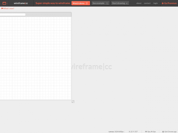
I’m still leaning towards wireframe.cc because of it’s minimalism. I like to have the bones and blocks, then move to coding a working prototype. I would get bogged down in Moqups trying to overwork things that I could do when coding.
But if you like to be further down the user interface waterfall — closer to a prototype than a wire frame — Moqups is a good solution. It’s quick to setup, quick to add elements in, and provides more options for customizing and tweaking elements. This gets you something more like the end product. There’s a lot of options that need at least a free account to work; that includes saving, sharing, and exporting your project. All in all a good option for mockups, just not my workflow.