One Tuesday every month, I’m going to round up a couple (maybe a few) awesome display typefaces to showcase and give a little breakdown on each one. If you have a suggestion you want me to take a look at, drop me a line. Let’s jump straight into some headline goodness.
Brand
Foundry : Lián Types
Designer(s) : Maximiliano Sproviero
Cost: $37
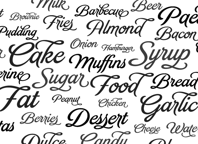
It’s no mistake the sample above is all about food; Brand is the perfect packaging script for tasty morsels. It has variety with OpenType ligatures and alternates to help it grab attention, but legibility and readability remain high when glancing on a store shelf or advertisement. There are also inline and shaded versions that would work great for warm, inviting invitations.
Braxton
Foundry : Fontfabric
Designer(s) : Evgeny Tkhorzhevsky
Cost: $95
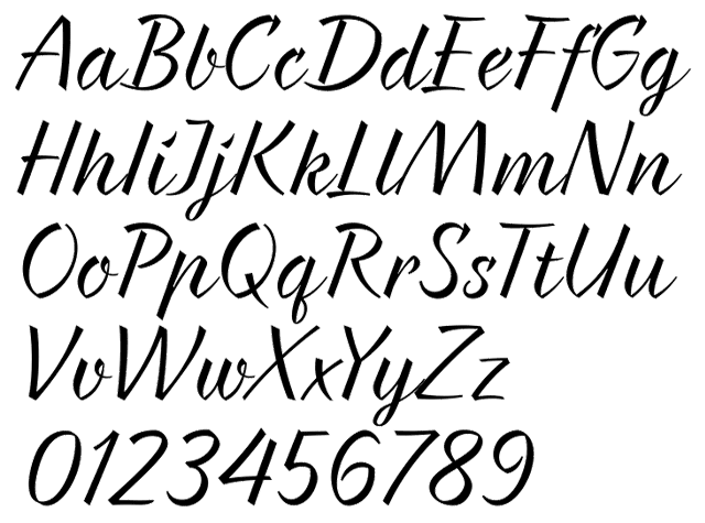
On the other end of the script spectrum is the pointed, calligraphic Braxton by Evgeny Tkhorzhevsky. Available in five weights, the deliberate style of the strokes give the letters strength. However, the repetition of the angle and vertical stroke weight destroy readability in any kind of longer sentence setting. With a few extra ligatures and stylistic alternates, Braxton would work well in packaging or an identity system.
Levi Rebrushed
Foundry : Levi Szekeres
Designer(s) : Levi Szekeres
Cost: FREE for personal use
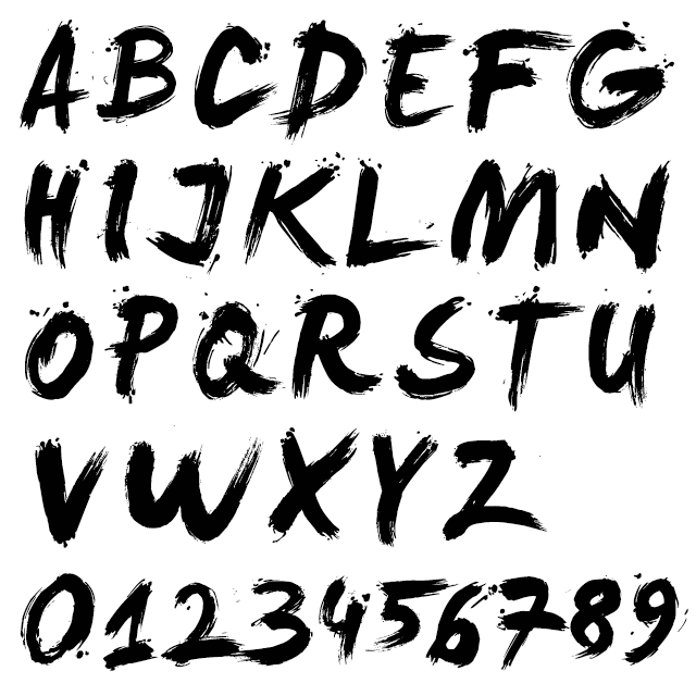
Similar to Braxton, Levi Rebrushed is built on very deliberate strokes. The rough, painter style isn’t for every project, but for the right grunge, punk, or edgy poster it is perfect. You will also need to check that you have all the glyphs you need as this is far from a professional font with full language support.
Brush Up
Foundry : Pintassilgo Prints
Designer(s) : Ricardo Marcin, Erica Jung
Cost: $24
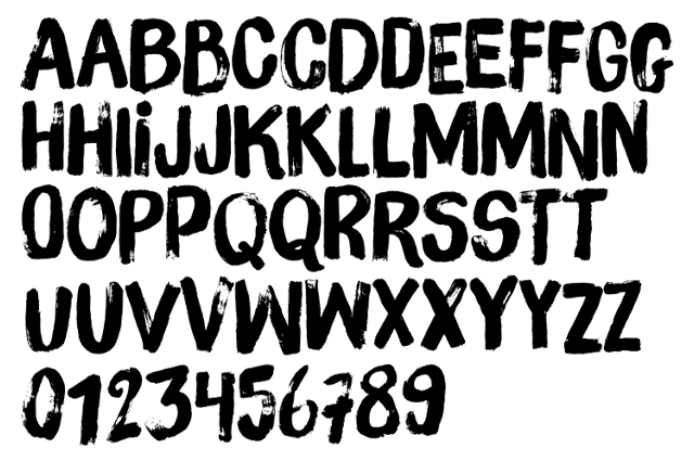
Sticking with brush style typefaces, next is Brush Up by the duo at Pintassilgo Prints. This hand-painted type contains three variations of each letter, two variations of numerals, a couple of extra punctuation glyphs, and even a few squiggles. Its style floats between grunge, hipster, and playful depending on how it is paired with imagery and even its color. That makes it a very versatile tool when needing a hand made touch.
Sketchnote
Foundry : Delve Fonts
Designer(s) : Mike Rohde
Cost: $99
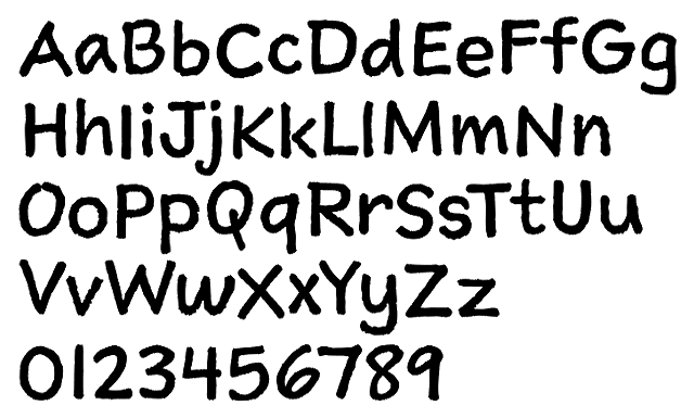
We’re sticking with hand made for the last three typefaces on this month’s round up. First up is Sketchnote from Mike Rohde. Mike is the guy behind the whole sketchnote idea and he even wrote a book about it. When he needed a hand-drawn typeface to set his book, he captured scans of his own handwriting and digitized them. The edges keep the slightly rough texture of ink on paper while the strokes show the slight variation of the human hand as it moves across a page. Great ideas and a great typeface.
Charmante
Foundry : Juraj Chrastina
Designer(s) : Juraj Chrastina
Cost: $59
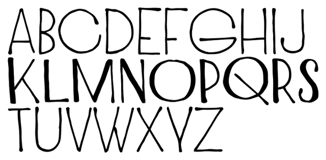
The second hand-drawn typeface on this month’s list is Charmante. It’s elongated proportions give it a ton more character and quirk. Shown above for K‑S the bold style adds even more interesting features by unevenly increasing only certain stroke weights. All of it combines to make a charming, casual font for invitations, greetings, and coffee shop menus.
Lango Px
Foundry : Pixilate
Designer(s) : Kemie Guaida
Cost: $24
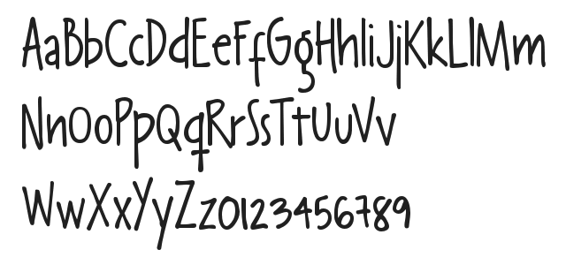
Last up this is month is Lango Px. This hand-drawn typeface is available in four weights; it has tons of bounce and playfulness in its tall, lean letters. Its casual and dare I say an excellent replacement for when a client demands Comic Sans on a project. Lango Px would also be perfect for baby announcements, children’s birthday cards, and other juvenile pieces. Pixilate also has several other handwriting style fonts worth checking out.


