Warioworld.com

September 19, 2014 at 1:53 pm

This arti­cle popped up in my RSS feed yes­ter­day and it was too much. Something welled up inside me to fight the evil design in the world in what lit­tle way that I could. I gave myself 24 hours to code a new land­ing page from scratch. (I had to give myself a good buffer because I knew noth­ing was get­ting done last night while I watched the foot­ball game. War Damn Eagle!) Along the way, I cleaned up the infor­ma­tion archi­tec­ture and rewrote some copy.

There’s way more that could be done, but I want­ed to give myself a hard dead­line. By putting myself on the clock, I did­n’t futz around. Nor am I hold­ing on to it because it’s not per­fect. It’s just an unso­licit­ed redesign of a land­ing page — noth­ing more, noth­ing less.

The cur­rent site lives at warioworld.com while you can see my redesign live on my new play­ground space.

Firefox Screenshot of Warioworld.com as it Currently Exists, 1996 web design, my eyes hurt

Warioworld.com Current Screenshot

Firefox Screenshot of Warioworld.com Redesigned Landing Page, unsolicited, responsive, web design

Warioworld.com Landing Page Redesign

Polaroid Transfer

March 3, 2013 at 1:56 pm

2013-03-02-polaroid_transfer, white building with red trim on textured paper

Cleaning out a stor­age unit this week­end, I found a lot of old work. Don’t be sur­prised to see more of it show­ing up here in the next few days and weeks as I sort through it.

Fifty-Two States

January 24, 2013 at 8:46 pm

So I was watch­ing the inau­gu­ra­tion the other day when the news point­ed out the “tax­a­tion with­out rep­re­sen­ta­tion” license plates on the pres­i­den­tial lim­ou­sine. Somehow I also remem­bered read­ing this arti­cle from December about Puerto Rico vot­ing on state­hood.

That got me think­ing: What would a fifty-two state flag look like?

Continue read­ing

Hipster Buttons and Magnets

August 30, 2012 at 8:52 pm

About two months ago, I made this awe­some wall­pa­per with some hip­ster icons. I liked the glass­es, mous­tache, skin­ny tie, and cas­sette tape so much, I decid­ed to make a set of but­tons and mag­nets. And if you are so inclined that you would like a set — maybe because they are flip­ping sweet, or maybe because they are such a great deal at only $8, or maybe because you can’t live anoth­er day with­out show­ing your hip­ster pride in a 2.25 inch cir­cle — you can pur­chase them through the shop.

Hipster Pinback Buttons and Magnets - Skinny Tie, Moustache, Cassette Tape, Square Rimmed Glasses, Cowboy Plaid Shirt with Pearl Buttons

It’s About Time

June 21, 2012 at 9:50 pm

Seems like things have been pret­ty hush around these parts late­ly, but I would like you to know that work has con­tin­ued on in the back­ground. I final­ly got so deject­ed and repulsed with the design of the blog that I start­ed work­ing on a new one. Then, I slow­ly spi­raled down the WordPress theme devel­op­ment hole along with respon­sive design and over­all aesthetics.

I’d like to think its bet­ter because it puts more focus on the con­tent. Let me know what you think or if you find some­thing bro­ken. I tried as much test­ing as I could. I know I have some work to do on my small screen media queries and lay­out, but I had reached a good frame­work and want­ed to go live instead of con­tin­u­ing to toil in obscu­ri­ty with this new theme. I would love some feed­back now that its in the wild.

A Spare Update — No. 1

May 26, 2011 at 3:21 am

I read this great arti­cle the other day over on Smashing Magazine and it’s pushed me to work hard­er on some projects I’ve had in the pipes. Here’s a lit­tle update on what I’m making.

I’ve been pick­ing at FontLab — learn­ing the basics and start­ing on some advanced OpenType pro­gram­ming. I’m begin­ning with my very own hand­writ­ing, as I’m pret­ty famil­iar with it.

Handwriting Typeface in Progress in FontLab - Glyph Palette View

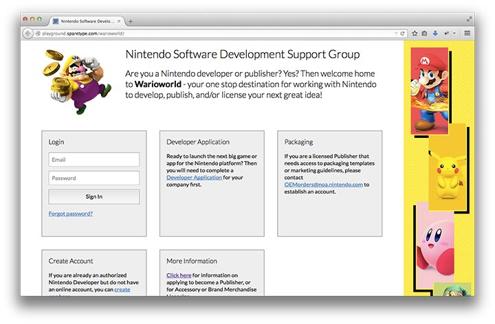
The idea is to end up with six to eight glyphs for each let­ter, three or four vari­a­tion glyphs for numer­als, and maybe two or three vari­a­tion glyphs for punc­tu­a­tion marks. Along with some cus­tom lig­a­tures and nifty OpenType pro­gram­ming, the con­cept will be a very nat­ur­al hand­writ­ten font with a lot of fluc­tu­a­tions and ran­dom­ness to best mimic real hand­writ­ing. As you can see from the screen­shot above, I’ve got a lot of work to do and holes to fill in.

The Other Thing I’m Making

Blackletter, Pixel, Type Slugs, and TypographyMy other awe­some project that I’ve put into action is some fun but­tons that I think are pret­ty cool and witty. I’ve put togeth­er a quick online shop­ping cart if you think they’re neat enough that you want to give me some of your hard earned money and get a set. *hint hint wink wink* There’s four reg­u­lar pin-back but­tons and four mag­nets to a set.

Right now, I’ve got the typog­ra­phy relat­ed set and a set with some skull designs. I think I’m going to work out a plan where I release new sets on a reg­u­lar basis and build a big­ger cat­a­log. And of course, some more styling tweaks to the shop­ping cart for more cohe­sive branding.

But as the arti­cle says…

I’m a true believ­er in per­fect is the enemy of good. I could per­fect the design until every pixel is exact­ly how I want it, until every fea­ture and fil­ter is live on the site, but for what? My own per­son­al sat­is­fac­tion? That’s just silly. Launch now, pro­vide value now, and sweat the details later.”

- Michael Aleo

I would like to add to that — “Everything is a work in progress, just like life.”

Alabama State Cup

February 28, 2011 at 6:54 pm

So I got a week­end project from my dad and threw up a quick web page for a soc­cer tour­na­ment he is putting togeth­er. It was a nice change of pace to do a quick, and some­what sim­ple, two page site.  There’s one page for all the info and a thank you/confirmation page if the con­tact form is submitted.

So, if you’re reg­is­tered to play soc­cer in Alabama and want to field a team, take a look and get in touch with them.

Alabama State Cup Soccer Tournament - April 1st - 3rd 2011 in Birmingham, AL