One Tuesday every month, I’m going to round up a couple (maybe a few) awesome display typefaces to showcase and give a little breakdown on each one. If you have a suggestion you want me to take a look at, drop me a line. Let’s jump straight into some headline goodness.
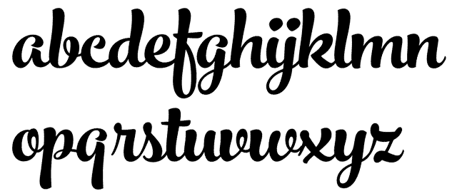
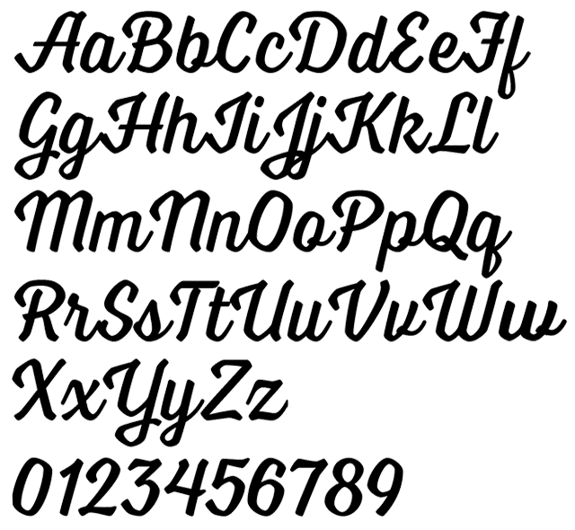
Stringfellows
Foundry : Nicky Laatz
Designer(s) : Nicky Laatz
Cost: $20
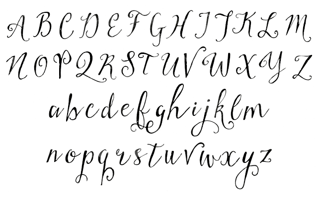
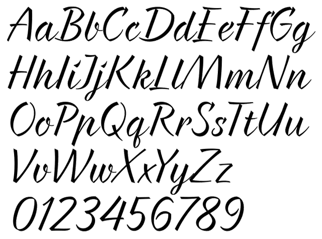
First up this month is a pen and ink script with plenty of hand-lettered quirkiness. Rough edges and an uneven baseline reinforce the lettering aspect of the font. The unevenness also gives it a good bounce so it flows nicely. It could use some more alternate glyphs to help the hand-lettered idea, but Stringfellows does come with an ornament companion font that has a few catchwords to use. Its look makes it prefect for wedding invitations, thank-you cards, and other personal correspondence needing a lettering-esque touch.
Voltage
Foundry : Laura Worthington
Designer(s) : Laura Worthington
Cost: $19 per style
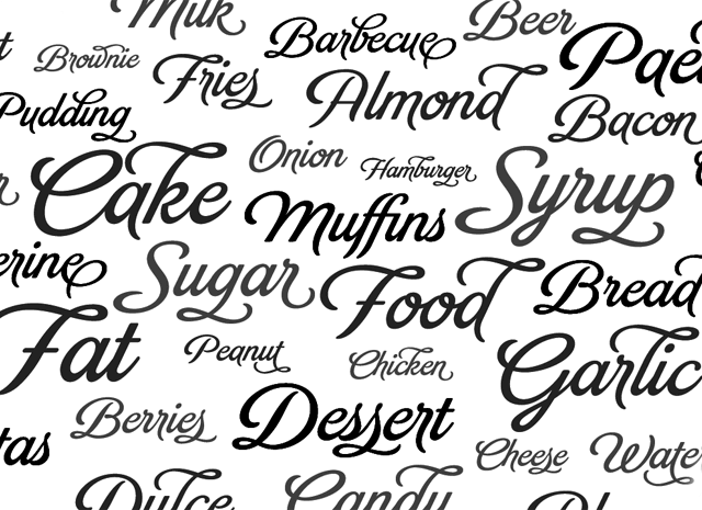
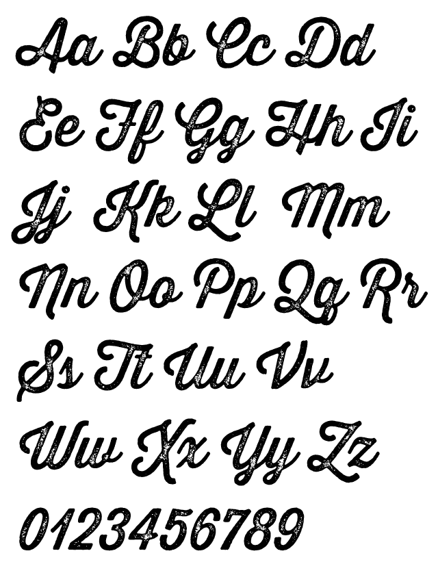
Now for a slightly different script. Voltage by Laura Worthington is a structured, utilitarian, and angular entry in the script genre. Given its solid construction and rhythm, the type has great balance and good readability for display uses. It does have a slight industrial feel but with some of its more fun alternates and swashes can break free of feeling machined. Voltage then becomes even more energetic and sign-painterly.
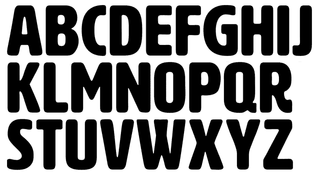
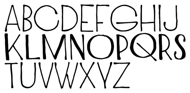
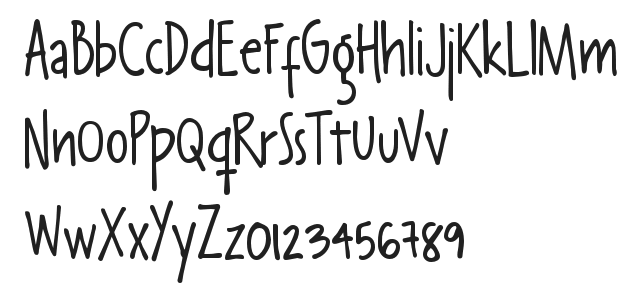
Ridewell
Foundry : Intelligent Design
Designer(s) : Kostas Bartsokas
Cost: $25 per style
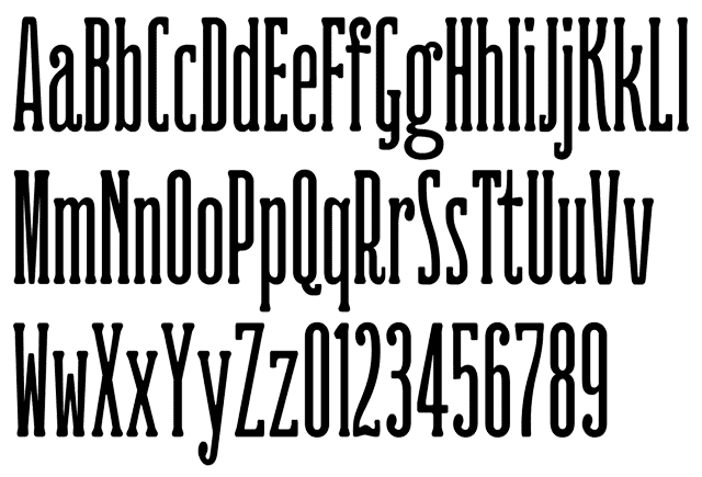
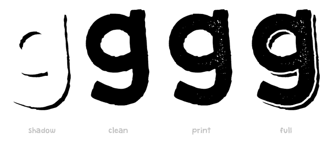
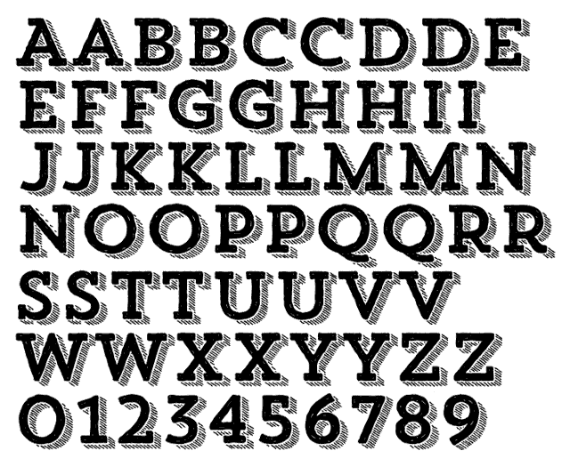
In the middle of the pack this month is a vintage, wood type inspired typeface by Kostas Bartsokas called Ridewell. Besides the clean version shown above, there is also a distressed printed version. In the spirit of old block posters, the fonts come packed with ligatures and alternates to create stacked letter effects. It’s compressed size gives it character and will help fitting it in small headline spaces. You don’t need much. Ridewell is definitely a display face where a little goes a long way.
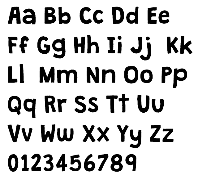
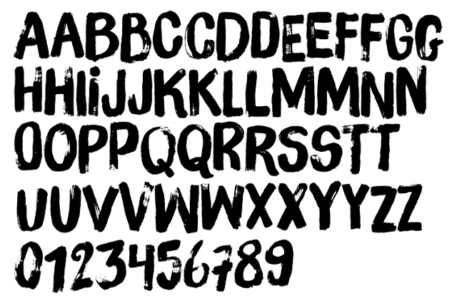
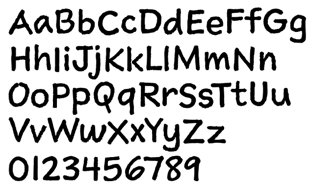
Marker Aid
Foundry : Pintassilgo Prints
Designer(s) : Ricardo Marcin and Erica Jung
Cost: $24 per style
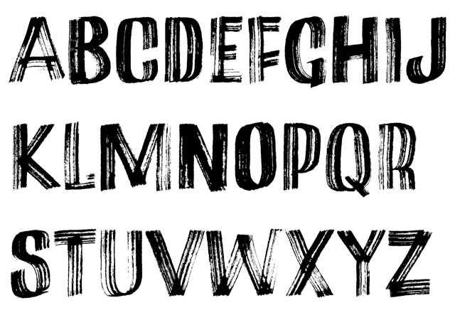
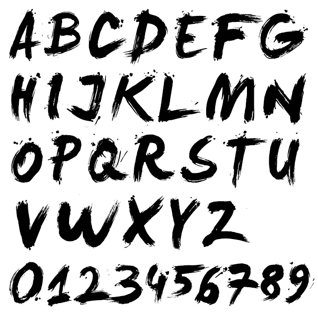
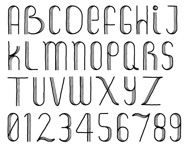
There’s plenty of sketchy, marker fonts floating around the Internet so why pick this one? Because it’s like four fonts in one. There are four variations for each letter and two variations for each number built in through OpenType alternates. Marker Aid is bold and expressive. That makes it perfect for music posters, organic packaging, and anything needing a lively atmosphere.
Elise
Foundry : Context
Designer(s) : Alex Liebold
Cost: $42 for all six styles
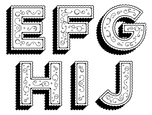
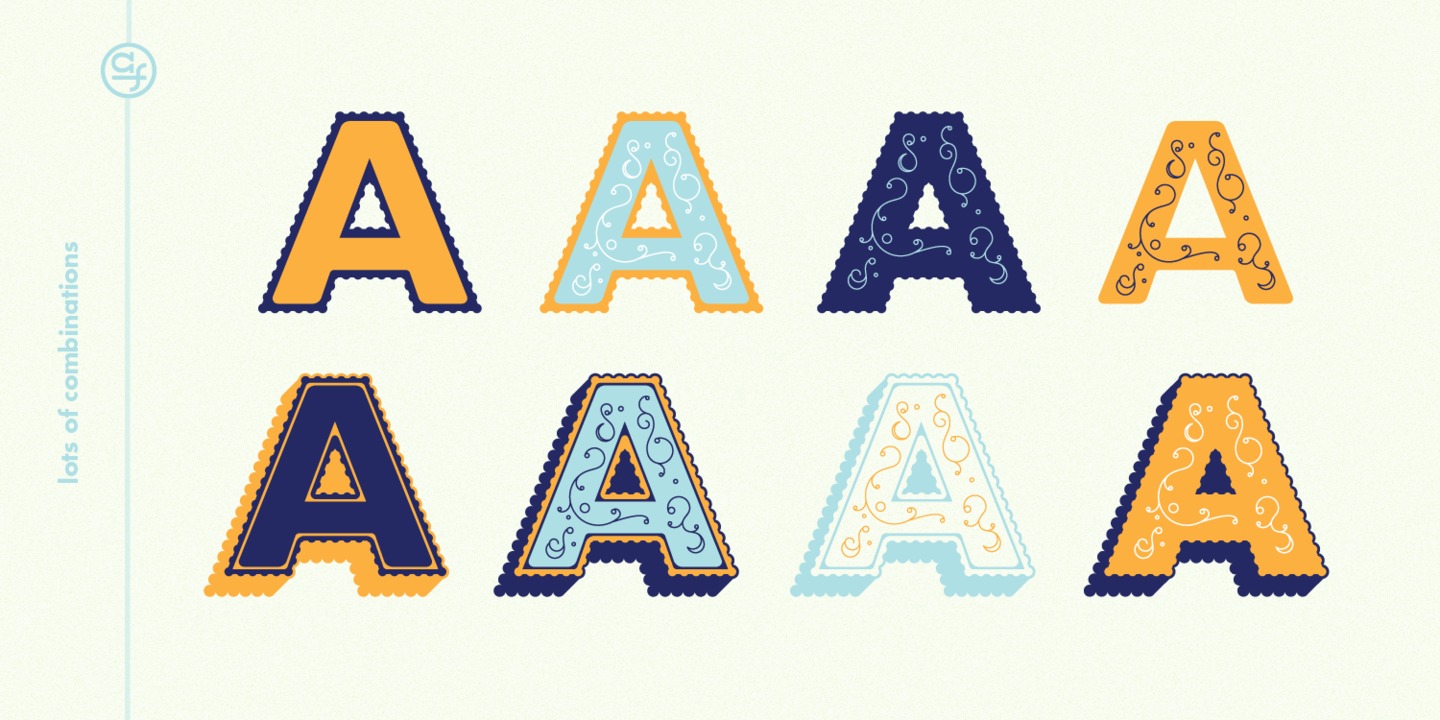
Oh, I’m a sucker for layered type. I only did a handful of letters above because you need to see Elise in action to really understand how awesome it can be. In the image below you can see the letter ‘A’ being built several different ways given the four parts Elise has — 3D, fill, ribbed, and flourish. All put together it is cute and charming typography perfect for invitations and announcements. Dialed back a bit with only the 3D or ribbed styles, you have a great retro poster face. That versatility makes Elise an excellent tool to have. (Also, if you just want the ornaments, they’re available for free.)