One Tuesday every month, I’m going to round up a couple (maybe a few) awesome display typefaces to showcase and give a little breakdown on each one. If you have a suggestion you want me to take a look at, drop me a line. Let’s jump straight into some headline goodness.
Salt and Foam
Foundry : Anna Karatcheva
Designer(s) : Anna Karatcheva
Cost: FREE
Inspired by the designer’s first time surfing, Salt and Foam is a great tribute to the ocean and waves. Shown above is Foam — with Salt being a straight-lined version of the same shapes. It captures the essence of water so perfectly that it would make a great headline font for any beach themed party, surf shop, or tiki bar. It’s fun, laid back, coastal cool.
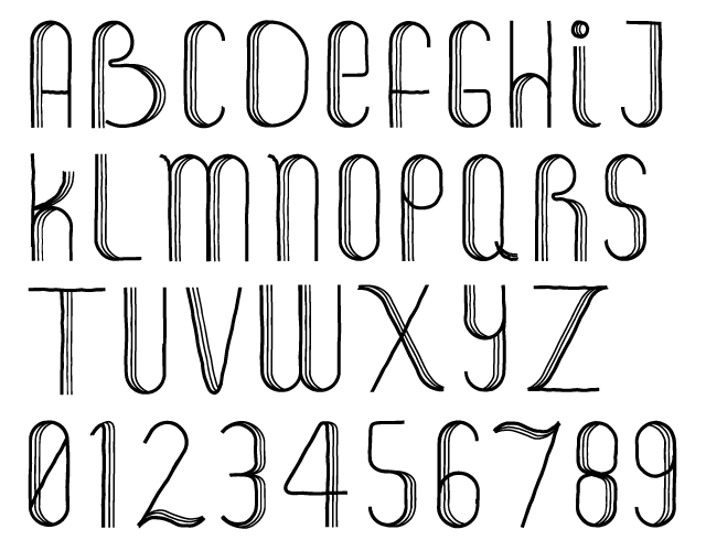
Saline
Foundry : Mika Melvas
Designer(s) : Mika Melvas
Cost: $35
Next up is another nautical inspired typeface by the name of Saline. It’s an angular, slightly upright script that bounces along. All the corners give it tons of personality. It would make a great starting point for an identity or logo component. The nautical theme is reinforced with a set of Opentype ornaments that can be used as icons, borders, or patterns.
Yorker
Foundry : UPPERTYPE
Designer(s) : Pedro Lobo
Cost: €25
I couldn’t come up with a better image than what Pedro Lobo already created to advertise his Yorker typeface. The animated .gif showing the layers build up is all his doing. He has built a six style layering system of an old school, collegiate block typeface. There’s the solid base, the outline, the 3D shadow, the outer shadow, the inner shadow, and finally the hatching stripes. I wish I could remember how to do permutations because that is a lot of combinations for building up a headline. The basic shapes are a solid base for the star of this typeface — all the choices. You can make a ton of different display pieces with all these styles so get to designing.
State Rough Stencil
Foundry : Device Fonts
Designer(s) : Rian Hughes
Cost: $39
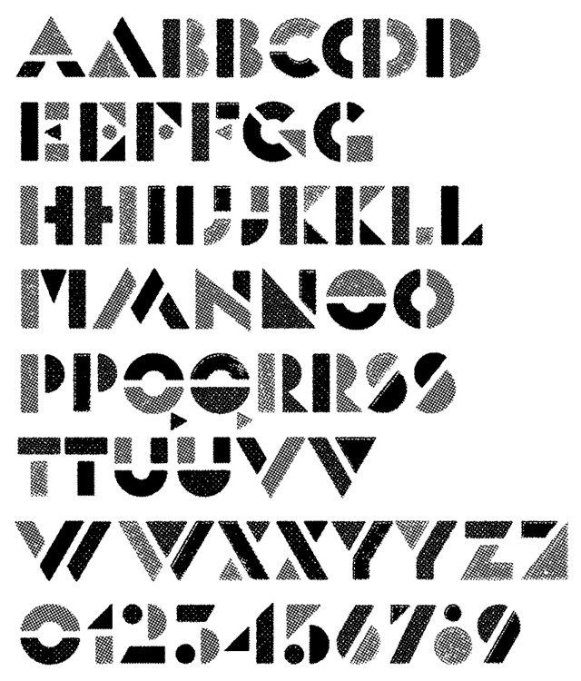
Straight-up retro cool is the best way I can think to describe State Rough Stencil by Rian Hughes. It has great stencil shapes, and I’m always a sucker for textured type. The fun thing about something so futurist is you can give it a modern twist or just indulge and go overboard with the 80s throwback feel. You know you’ve seen an album cover, concert poster, hell maybe even a high-top sneaker ad with something like this. It’s cool and anybody that says otherwise is lying.
Final Mentions & Inspiration
- Attitude by Emil Kozole — Experimental, geometric sans-serif
- Yasakin by BMD Design — Hand lettered logo and identity concepts
- Ut One by Ultra Types — Experimental blackletter with geometric construction
- Typographica Favorite Typefaces of 2012 — It goes with out saying, must read
- The Death of Google Reader — Long live RSS!
- Tiny Tiny RSS — I’m probably going to roll my own feed reader with this open source software
- Feedly — The popular choice that seems to be filling the void
- Pooping Pixel Pigeon — Come on, hilarious (Via Veerle)
Heather Hudmon liked this on Facebook.