One Tuesday every month, I’m going to round up a couple (maybe a few) awesome display typefaces to showcase and give a little breakdown on each one. If you have a suggestion you want me to take a look at, drop me a line. Let’s jump straight into some headline goodness.
Thirsty Rough
Foundry : Yellow Design Studio
Designer(s) : Ryan Martinson
Cost: $9 (introductory offer)
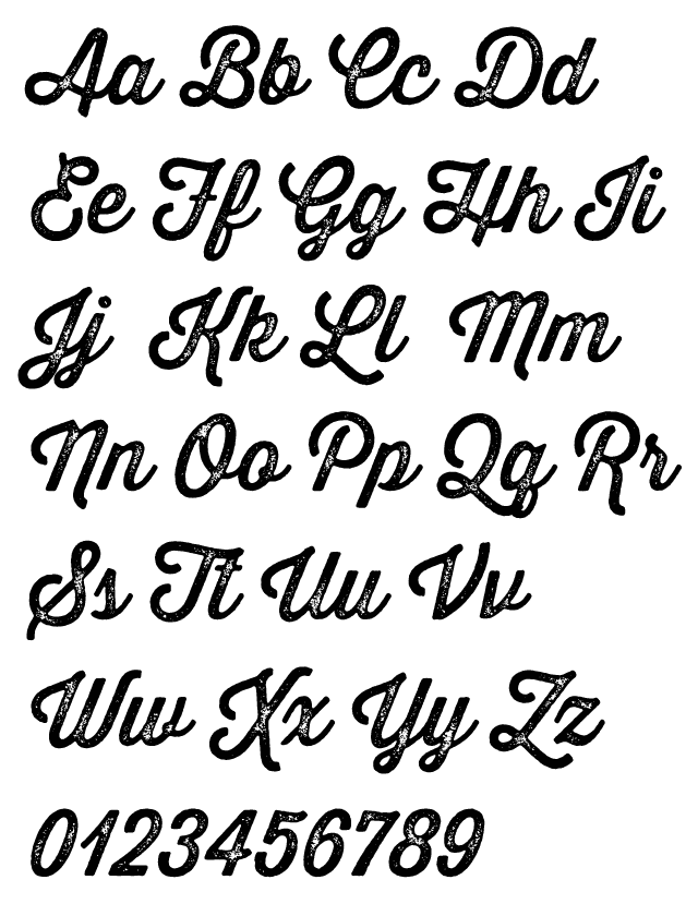
First up this month is another great release by Yellow Design Studio called Thirsty Rough. It is a pick your poison of distressed fun. With four weights and four levels of increasing weathering for each weight you get sixteen fonts to play with. Then there is an offset shadow version for each weight, plus a fun set of textures to round out the font count at 21. The block printed feel reinforces the vintage quality of the script making it perfect for retro applications in packaging and poster design. (If distressed type isn’t your thing, there’s also Thirsty Script to check out.)
Salamander
Foundry : Fenotype
Designer(s) : Emil Karl Bertell
Cost: $24.50 (introductory offer)
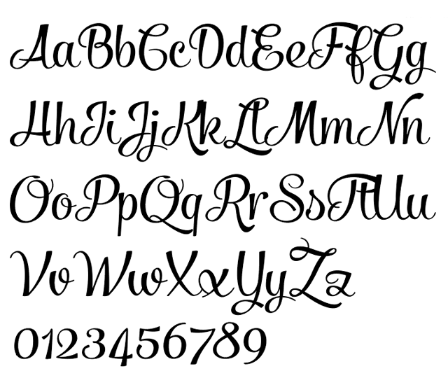
Salamander is a fun, bouncy script from Emil Bertell released through his Fenotype foundry. With close to 570 glyphs there are three and four variations for uppercase and lowercase letters with multiple degrees of swash. Also available is an ornament set with even more curls, loops, and swooping curves. Really you should go check out all Emil’s scripts like Mishka and Mercury Script because they are all full of personality and would look great in all kinds of display settings.
Blyth
Foundry : Nick Slater
Designer(s) : Nick Slater
Cost: FREE
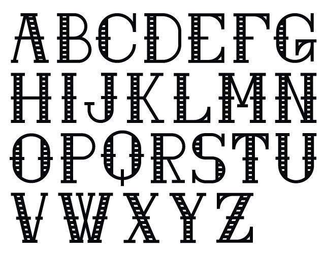
Blyth is a work in progress. Currently available as an Illustrator file of the outlines, Blyth shows tremendous promise as a display face. A fun mix of geometry with stripes makes the version shown above an Art Deco treat. It is also available filled-in and outline only. Blyth is definitely a font to watch.
Final Mentions
- Free dotted sketch paper for mockups and interfaces.
- The last roll of Kodak Kodachrome that would ever come off the line. (Via The Verge)
- Dune 2 from 1992 is now playable in browser. (Via Polygon)
- Animation easing gallery for more realistic movement (Via Noupe)