 I originally wrote the following post as a research paper for an undergraduate art history class. Later, I took the text and used it as the basis for designing a book in a graphic design class. I’ve always loved all that I learned on the project and can honestly say that I enjoyed every hour I spent either in the library reading or in front of the printer trying to get spreads to line up.
an introduction to typography’s beginnings based on a historical research paper
Typography, and graphic design in general, is an ever evolving, process driven field. This is the same today as it was 500 years ago when mass printing was just beginning in Europe. By examining the evolution and typography of this incunabula period, the novice designer can learn both the intricacies and history of type.
The Italian Renaissance that occurred from the fourteenth through sixteenth centuries caused revolutionary changes in human history that still impact society and culture today. One aspect that witnessed phenomenal change was that of book production. Technological achievements combined with cultural revival of classical antiquity created standards of production and typography that have served as the foundations of both fields since their inception more than five hundred years ago. The change was an evolutionary process that involved both creative inspirations from the classics of Greece and Rome as well as trial and error refinement of printing techniques.
Western civilization developed reusable, moveable type around 1440. The major breakthrough came from the perfection of the mold in which to cast each block of type. With this new method, hundreds of pieces of type could be cast in a day allowing for mass production of printed materials. (Dowding 3) From its initial birth around Mainz, Germany the innovations quickly spread throughout Europe as entrepreneurs saw the potential for mass printed material in other markets and began establishing presses across the continent. Having found its way to Italy, printing and typography underwent fundamental changes at the hands of humanist scholars and the printers associated with providing these educated men with reading material.
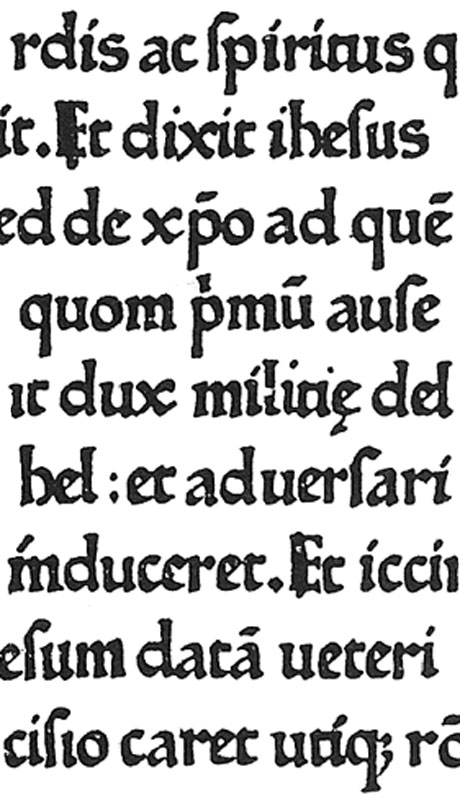
Two Germans, Conrad Sweynheym and Arnold Pannartz established the first printing press on Italian soil at Subiaco near Rome in 1465. (Dowding 20) They brought with them the conventions of German type that had developed from the formal manuscript hands that flourished during the Middle Ages. (Dowding 5) This style of type is known as textura for its very dense, dark presence on a page and textured effect created by the condensed letterforms. Humanist scholars later labeled the style black letter and gothic for its association with the unenlightened, barbarous era of the Middle Ages. Textura lettering developed from the need for a quick, efficient writing style for scribes who had to handwrite books during the Middle Ages and to conserve space on a page. (Meggs 54) Mass printing eliminated the need for a quick writing style. The knowledge of making paper had also spread along trade routes from East Asia to Europe and had lowered the cost of materials on which to print. (Meggs 64)
These technical advances were coupled with humanist research into classical texts. Scholars such as Francesco Petrarch and Coluccio Salutati were working from the late fourteenth-century onwards at spreading the classical writings of ancient Greek and Roman authors, poets, and philosophers. Besides reviving their ideals, these humanist scholars also sought to revive the ancient writing styles found in these volumes of classical texts. They saw textura lettering as the writing of the barbarians who had destroyed classical civilization and thus wanted to return to what they believed was authentic Roman writing. (Twomey 137) The writing was in fact from the ninth through eleventh centuries in a form known as Carolingian minuscule from the scholarly revivals of Charlemagne. He organized and ordered the standardization of writing in scriptoriums and the revival of classical literature. This move preserved the knowledge of classical antiquity that the humanist scholars later relied on when they sought their own revival in the fourteenth-century. (Meggs 49)
The preference by the Italian humanists for Carolingian minuscule over gothic textura was firmly in place by 1465 when Sweynheym and Pannartz began printing in Italy. The humanists also admired the original Roman majuscules found inscribed on the ruins of ancient monuments such as Trajan’s column. These two very different styles of letterforms were in need of reconciliation if they were to be used in harmony by a printer. Sweynheym and Pannartz realized this when they moved to Rome in 1468 and revised their initial type to have thinner strokes and more space between letters. However, the resolution of these typestyles into a definitive form was achieved by Nicolas Jenson in Venice in 1470.
Nicolas Jenson had studied printing in Mainz and moved to Venice around 1468 to take advantage of the emerging market for books. (Meggs 94) Once in Venice, Jenson studied the inscriptional majuscules and current humanist script minuscules in preparation for cutting his new type. Jenson thinned the strokes on his minuscules as well as adding more roundness to the letters. These changes created a more even tone across a page balancing positive and negative spaces. The revolutionary change though in Jenson’s type is the addition of serifs to the minuscule characters. Combining the swoosh leading out of a pen drawn letter with the chiseled perpendicular endings of the Roman majuscules, Jenson unified the two styles into one. This is historically viewed as the first true roman type thus establishing a new typestyle.
Jenson used his type to print 155 books from 1470 until his death in 1480. The type and press were bought by one of Jenson’s workmen Andrea Torresani who would later be instrumental in establishing the Aldine Press of Aldus Manutius. (Barolini 47) Besides influencing the Aldine Press, Jenson’s type has served as inspiration through the years to typographers wishing to create their own roman types as well as established roman letters as the de facto type for text and reading material in Western culture. This establishment owes in part to the proliferation of printed books by Aldus Manutius starting in 1495. (Dowding 32)
A humanist scholar and tutor, Aldus Manutius dedicated his life to teaching the language and writings of Greece. Through connections with the humanists of Italy and the help of Andrea Torresani, Aldus gathered Greek texts and organized the printing of an incalculable amount of knowledge. His contributions to typography are equally as immense simply by the sheer extent to which his works spread, and were copied, carrying with them both the ideals of the Renaissance and the roman type cut by Francesco Griffo and based on Jenson’s model. Aldus also pioneered book layouts and alternative movable types.
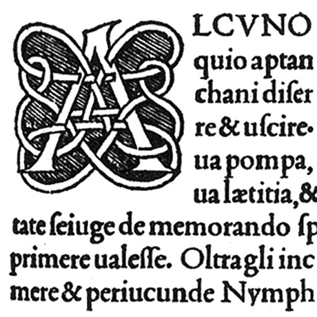
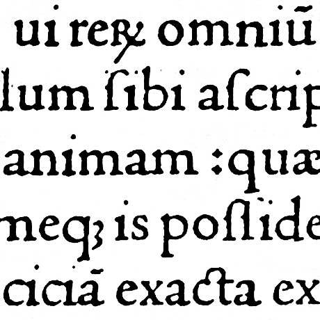
The Aldine roman can be seen in the Hypnerotomachia Poliphili that Aldus printed in 1499. The book also illustrates the integration of imagery and type on a page as well as the overall layout of margins and space. These design characteristics were adopted throughout book production and still hold influence today over the positioning of text for general reading material. Another layout Aldus pioneered was that of a smaller page size, 3.75 by 6‑inch over the 8 by 11.9‑inch. (Meggs 101) For this smaller space, Aldus had Griffo cut a new type that combined the new serifs of the roman typestyle with the slanted compressed nature of script handwriting. Thus, the first italic type was born in 1500.
An even greater achievement of the Aldine Press was its rescue and proliferation of classical works in Greek. For such an undertaking, Aldus oversaw the creation of a Greek typeface modeled on the handwriting of Greek scholars and scribes and cut by Griffo. (Davies 14) Aldus also pioneered two techniques in association with printing Greek types and accents. The process involved what is known as leading, or adding space between lines of type. This allowed the second technique of adding accents throughout a line of type instead of having unique letters cut for every possible accent. (Davies 18) Both methods increased the flexibility of printing and how a page could be arranged.

A Decorative Initial Capital and Body Copy from Aldus Manutius Hypnerotomachia Poliphili — Venice 1499

Closeup of Italic Letters Cut by Francesco Griffo for Virgil’s Opera printed by the Aldine Press — Venice 1501
A final undertaking that was never completed by the Aldine Press due to Aldus’ death was a Polyglot Bible. An initial proof sheet from 1501 survives showing a three-column layout of corresponding Hebrew, Greek, and Latin. The Greek and roman types used are not new, but the Hebrew is a new creation by Griffo. The first in Venice, the type is extraordinary for its geometry and groundbreaking use as educational material for humanist studies. (Davies 52)
It is worth mentioning that better-executed, more legible types later replaced the Aldine italic and Greek starting around 1525. (Dowding 47) These improvements underscore the nature of Aldus and Griffo’s work as steps in the evolution of typography that continues to this day. Their work was inventive and original for its time, but it was inspired by Jenson who was inspired by the humanists who were inspired by the Carolingian scribes; it went on to inspire the sixteenth-century typographer Claude Garamond in Paris and later in the eighteenth-century William Caslon I in England. (Dowding 32)
Today, typography and print production have undergone another significant change in the move from material to digital workspaces. Typefaces no longer physically exist as metal pieces but as pixels of light on computer screens. The change is similar to the move from handwriting to moveable type that occurred in the fifteenth-century. New possibilities with a new medium were created and typographers looked to the past for inspiration in trying to re-create past types, to update them, and to completely reject them in search of better ways of communication, much like Sweynheym, Pannartz, Jenson, Griffo, and Aldus did at the birth of printing and typography.
Their contributions refined and perfected the technical achievements of Mainz and provided the foundation for Western typography that we still use today. They also provided the process of looking at the past for inspiration. As such, these great works of Italian Renaissance book production stand as hallmarks of their field and as pillars of human civilization for the knowledge and spirit they preserved.
For More Inspiration / Works Cited
- Baronlini, Helen. Aldus and His Dream Book. New York, New York: Italica Press, 1992.
- Davies, Martin. Aldus Manutius: Printer and Publisher of Renaissance Venice. Malibu, California: The J. Paul Getty Museum, 1995.
- Dowding, Geoffrey. An Introduction to the History of Printing Types. New Castle, Delaware: Oak Knoll Press, 1998.
- Fletcher III, Harry George. New Aldine Studies. San Francisco: Bernard M. Rosenthal, Inc, 1988.
- Meggs, Philip, and Alston W. Purvis. Meggs’ History of Graphic Design. 4th ed. Hoboken, NJ: John Wiley & Sons, 2006
- Seaby, Allen W. The Roman Alphabet and its Derivatives. London: B.T. Batsford, Ltd, 1925.
- Szepe, Helena Katalin. “Desire in the Printed Dream of Poliphilo.” Art History 19 (1996): 370–392.
- Twomey, Juliet Spohn. “On Type Whence Jenson: A Search for the Origins of Roman Type.” Fine Print 15 (1989): 134–141.


