A Mobile, Alabama institution known far and wide for amazing baked goods, the shop was in need of a new street sign and new look. The shop had never taken a deliberate approach to identity or branding and wanted to see a wide range of ideas before narrowing in on a solution. This left the design brief wide open for the first round of ideas. Everything — typography, color, iconography — was up for grabs.
The Old
![]()
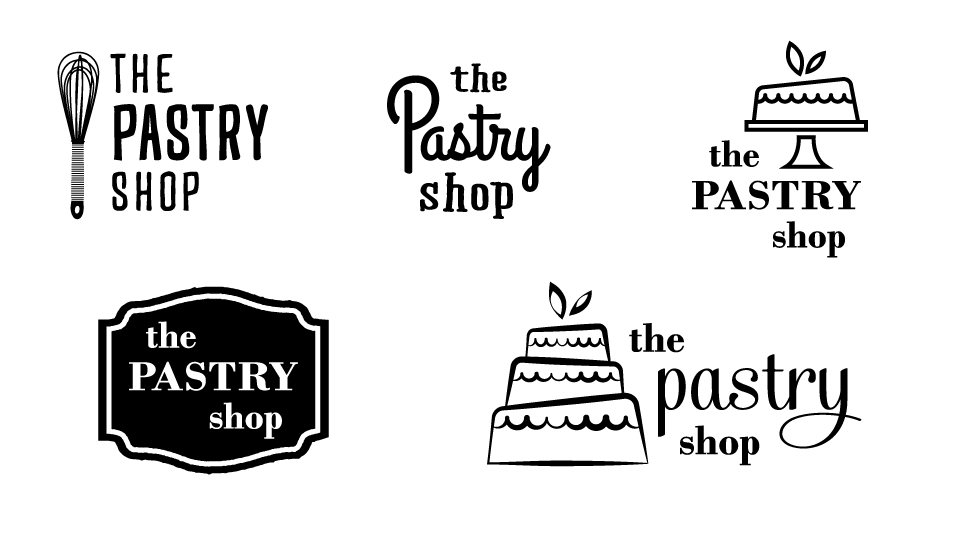
With a huge range of options presented for the first round, we were able to discuss ideas better and start narrowing in on keywords. A refined, but playful quality emerged to describe the identity. More traditional, than modern. Less hipster cupcake boutique but still fun, inviting, and special. The logo also started to solidify around the idea of a cake. Below are a few of the early concepts that helped make discussion of the identity easier.
The New
A cake is a pretty obvious solution for a bakery, so the challenge was elevating it to something more unique. I solved this challenge in two ways. By using uneven weight in the outlines of the layers, I broke up the structure of three boxes stacked on top of each other. The second way is the cake’s interaction with the typography. The staggered alignment mirrors the cake, but the different size of “Pastry” contrasts with the cake’s structure while balancing the structure of the logo as a whole.
![]()
Color
Another way I decided to add character and interest to the obvious cake-based logo was in it’s color treatment. Instead of settling on one color combination, I’ve left open the possibility to use multiple color variations for the cake. Similar to the wide variety of cakes they sell, The Pastry Shop logo can shift personality to complement a particular message or use. Mmmm, chocolate cake!
The Wrap Up
Overall, this was one of those dream projects since the initial exploration was wide open for any possibilities. While I initially avoided the cake as an obvious solution, I slowly worked my way back to a unique treatment and combination that works for The Pastry Shop’s logo. I can’t wait to keep building on the identity and try out some fun applications of the logo elements.